[Is 4k the new 64k?...................]
today's episode of "classic questions of the demoscene"...
today's episode of "classic questions of the demoscene"...
Watching 4k intros at Revision 2017 made most people say that 4k is the new 64k.
Well, that's hard to prove, but at least we've seen one revision 8k that was a nearly 1:1 remake of an old 64k ("rise" by mindforce and park).
So maybe 4k is half the new 64k.
Jokes apart, let's see how modern 4ks and 64ks compare.
4ks and 64ks share some limitations. Both have to use generated music, both rarely use stored textures. They are both not using precalculated video, even if some groups, starting from Complex, did this in the past.
64ks can use some stored samples, but just one or two may fit the 65536 bytes limit - so using them doesn't give a clear advantage to 64ks anyway.
Finally, the use of shaders everywhere made 64ks and 4ks even more similar than before.

Believe me, I always wanted to do this
Still, 64ks have elements that are not present in 4ks (for now).
For example, Conspiracy's intro from Revision 2016 had some evocative black silhouettes recalling human figures. "Gubernyia" from Macau Exports had some of these too, far in the background. 64ks can have a longer and better "story" inside. Just think of "eidolon" by Poo-brain or of (the unfortunately a bit cheesy) "h-immersion" by Ctrl-Alt-Test. Some 64ks can use gm.dls with a bit of trickery. In general, 64ks can have some additional content inside that makes them more complex and various.
But despite of this, having 60 additional whopping kilobytes often acts like a psychologically inverse mechanism that makes coders waste them.
Take "Off" by Mercury. No matter if they say "we have this new shining engine", "we have the bestest synth in the world", "we have a lot of dust on the camera" ("and hexagonal lens flares too") - their 64k seems a lot more like a 4k (at the point that somebody called it "a screensaver"). The same, unfortunately, goes for the latest intro from Conspiracy.
So, does a modern 4k intro look like an older 64k one?
Let me examine some very good candidates.
For example, "absolute territory" by prismbeings reminded me a lot of old intros like "Fresnel 2" by Kolor or "Transgression 3" by mfx. But if you watch them carefully, you see that "absolute territory" looks more like *one* single scene of Fresnel 2, leaving apart the visual quality of the two productions.

Fresnel 2 vs. Absolute territory
Let's take the one I consider the "state of the art" 4k in 2017, "horizon machine" by Eos and Alcatraz, and compare it to the winner 64k of Revision 2012, "gaia machina". Even if you can visually see the gap in those 5 years (the first "machine" is way better for rendering quality), content-wise, or looking at the camera paths and cuts, or even for the quality of the content and objects in the latter one, "gaia machina" still stands higher than the 2017 4k.
The same thing happens if you compare it to more recent winners of Revision: there is almost no competition there.
It seems clear that a middle placed 64k intro like "Off" or "Vessel" can be compared (and maybe lose) to a top-notch 4k like "horizon machine" or "Joia" by Collapse. But 64k clearly win if we take a better designed, packed and polished intro like "eidolon" or "guberniya".

Guess which one is the 4k and which one the 64k
Now we can ask the final questions.
Has the gap between 4k and 64k reduced?
Maybe. Maybe now 64ks and 4ks have the same shaders, the same synths, the same effects, and they are so close that you can't distinguish a mediocre 64k from a brilliant 4k (but still you can distinguish "Chaos Theory 4k" from "Chaos Theory", I suppose).
Is 4k the new 64k?
Not really. Maybe modern 4ks surpassed the average 64k, but still 4ks are runner-ups compared to a jaw-dropping 64k of 2017 or previous years. And probably they will always be.
P.S.: oh well, I didn't notice but 10 years have passed from this post here.
Seems like I "already" have the task to write the second chapter of 4k history (2007-2017).
Stay tuned for more.
[interview #4: This must be a *Conspiracy*...................]
From the suburbs of Hungary to the top of the Demoscene...
From the suburbs of Hungary to the top of the Demoscene...
Revision 2016 was the definitive proof that 64k intros have still something to say.
Conspiracy is one of those demogroups that made 64ks the main reason of their existence.
In fact, they are in activity back from 2003, and released mostly 64k intros, a pair of 4ks and a couple of demos (one of them could have been a 64k too).
I asked for an interview to Gargaj, musician/coder/demoscene-myth of Conspiracy, shortly after their return from Revision, where Conspiracy placed 2nd right after Mercury (see the results here), and he extended the questions to the rest of the group.
Warning: if you are among the 3 demo freaks that have been on the moon recently and haven't seen "Darkness lay your eyes upon me" (DLYEUM from here after), stop reading this and go watch the intro (this interview contains spoilers and tool screenshots that would ruin the experience).
Then come here again (if you remember the address).

1) Almost 13 years have passed since "project genesis". That intro amazed for the incredible amount of content and for the general cleanness of the scenes. What has changed between the tool used to build "project genesis" (a.d.d.i.c.t. 0.9) and the tool used to create DLYEUM? In which way is the tool used to build DLYEUM "better" than the first one?
A lot has changed, and a lot hasn't.
For one, we learned to code and not just mess around. The tools became pretty sophisticated compared to the first iteration. They are faster, stable, easier to work with and can do a lot more. We overcame several limitations that seemed impossible back then, and not just because of the increase in processing power or the advent of shaders. The tools we used until 2006 had no notion of pixel or vertex shaders, they used fixed pipeline GPU acceleration. Our current generation tool has ditched CPU based texture generation for a GPU based one, and has a proper material system for utilizing the GPU.

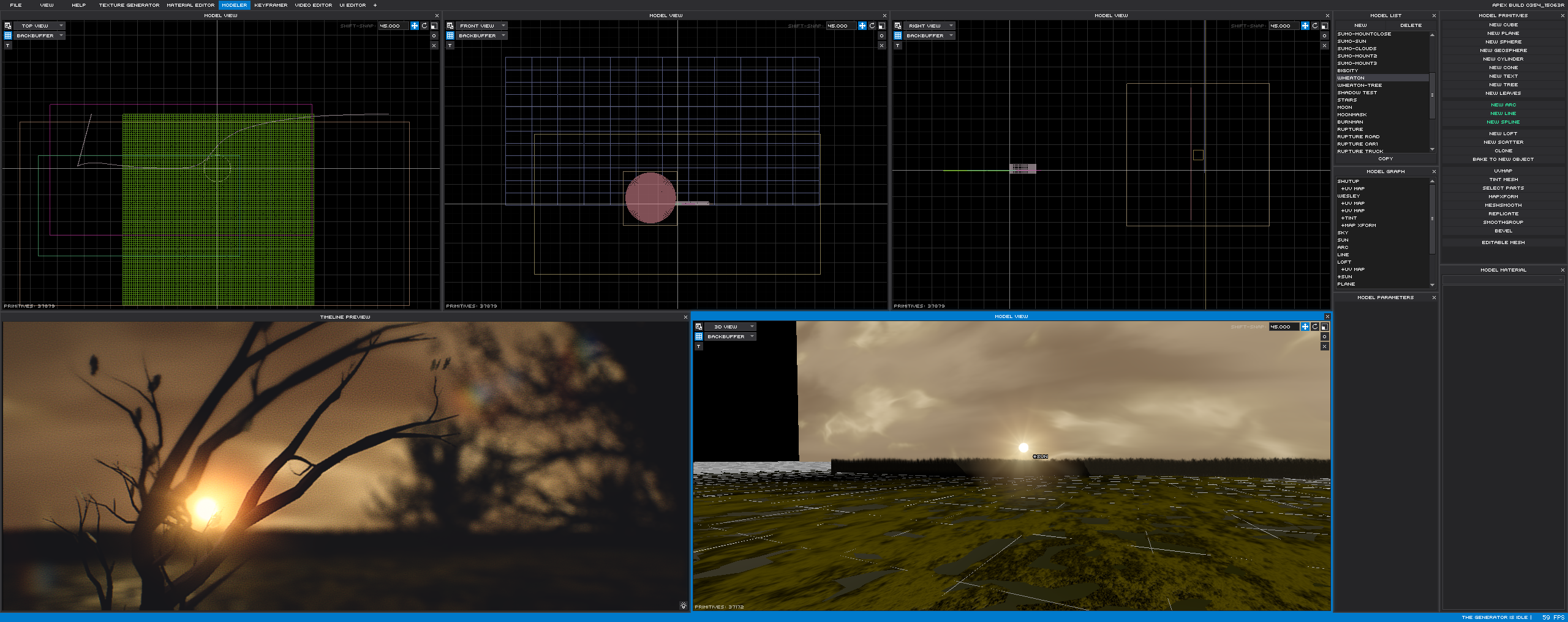
The dark city buildings as they appear in the tool used for DLYEUM
Other than these two changes, the rest is basically the same as originally: the mesh generation, animation and especially the timeline concept has stood the test of time.
One thing that had the largest impact was the reduction in the turnaround time when creating visuals, and the evolution of our tool was partly driven by this. The fact that we can go back to a scene and modify a texture or a model and immediately see the result in all its post-processed glory helps immensely in achieving the quality that we'd like to put on the screen. In short: the concepts are the same but more refined, and built into a tool that is "production ready".
2) Same question for the synth used in both intros.
For the first two intros ("project genesis" and "a place called universe") we used a rudimentary tracker+sample generator combo that we knew wouldn't last, but it did the job at the time.
Since "Beyond" we've been using the same modular framework for audio, which allows us to do incremental upgrades without losing any of the familiarity or having to worry about the actual audio engine. It also allows us to deprecate modules that we no longer want to use.
In this particular intro we've tried a few techniques that we felt were needed to match the subtlety of the imagery, and the relatively small (initial) scope of the intro allowed us to experiment without the responsibility of having something that is a permanent solution.
3) Is there a "story" behind DLYEUM?
There is, albeit a loose one.
The initial concept was to create something dark and looming as a sequel (or spinoff) to our other intro called "One of these days the sky's gonna break", but there was no story or storyboard, just a bunch of scenes that we thought would fit together. The narrative created by the final intro is open to interpretation, and that was kinda our goal too: let the viewer fill in the holes, and make up a story of their own if they want to, which we've been happy to see that people have been doing.
4) The silhouettes in DLYEUM are great and original. Are those 3D models? Can you tell a bit more on the tech used to build them?
There were plans to create the human figures in 3D using primitives, but ultimately we imported small vector images and processed them a bit further in the tool to add more detail.

At the end, the simplest ideas are the best ones. Zoom in to spoil the magic
5) Did you have to do some size-fighting to stay under 65535 bytes for DLYEUM or you managed to include everything you wanted in the intro?
We ran out of time before we ran out of space, but just barely. We had 53 bytes left when the deadline came - we have never been so close before. The final version is going to be a challenge to do, because with the lack of time and sleep came the loss of quality in some scenes, which we want to remedy with a proper release. We have no definite timeframe for when that's gonna happen, but we hope to have it released by next week [4th to 8th of april 2016 for who's reading].
6) Did the result of the party (you came 2nd by 2 points, 1890 to 1888) disappoint you, or you think Mercury deserves the 1st place? Has "fermi paradox" something "more" than DLYEUM in your opinion? Be honest.
At this point the results don't matter, this is how it was meant to be.
The Mercury guys are very good friends, and having seen how much work they put into their release, we're happy either way. The two point difference just shows that the audience couldn't decide between the two intros either, and neither could we - like we said at the prize ceremony, "I guess we're even now".

I expected an answer a little bit more on the line of "Who is the best now YOU MADAFAKAZZ?"
We're happy with the way our intro turned out, we're very happy that the competition was tough again, and most importantly that 64k is back with a vengeance.
We still think it's the perfect demo platform.
7) I asked the same question to IQ some years ago for 4k intros: where are 64k intros headed from here to 10 years in the future? In my opinion, with 4k intros the scene hit something like an "hard edge", so someone had to "invent" 8k intros to go ahead. 64k seem still capable of impressing the audience.
If 4k (and especially recent 8k) intros are any indication, 64k still has a lot left to offer, although we don't think this is fundamentally about size limits.
We're not using any special technology in our intro, it's simply about how you present your content with the help of proper composition, framing, and coloring. This is what usually makes an impression in demos too, and if you do it in 64k, it's an added bonus.

I can't stop shivering when I look at that house. Even in that demotool.
4k seemed to hit a "hard edge" mostly because everyone and their mother started using distance fields/raymarching, which resulted in very similar-looking intros and a lot of people got bored of that.
We have already passed the point in the evolution of the demoscene where putting random flashy imagery one after the other doesn't cut it anymore, or let's say it doesn't really stand out. A few people commented on Pouet that finally they are starting to see inspiration being pulled from outside the demoscene, and that's where we can still improve, or at least it's one direction. The old demoscene conventions and "bring back the only demo art" have their place and we must know where our roots are, but from time to time it's worthwhile to take a look around in the world of film and other artistic media as well.
We definitely don't mean to stop trying to push the limits, but they have to be pushed both technically and artistically.
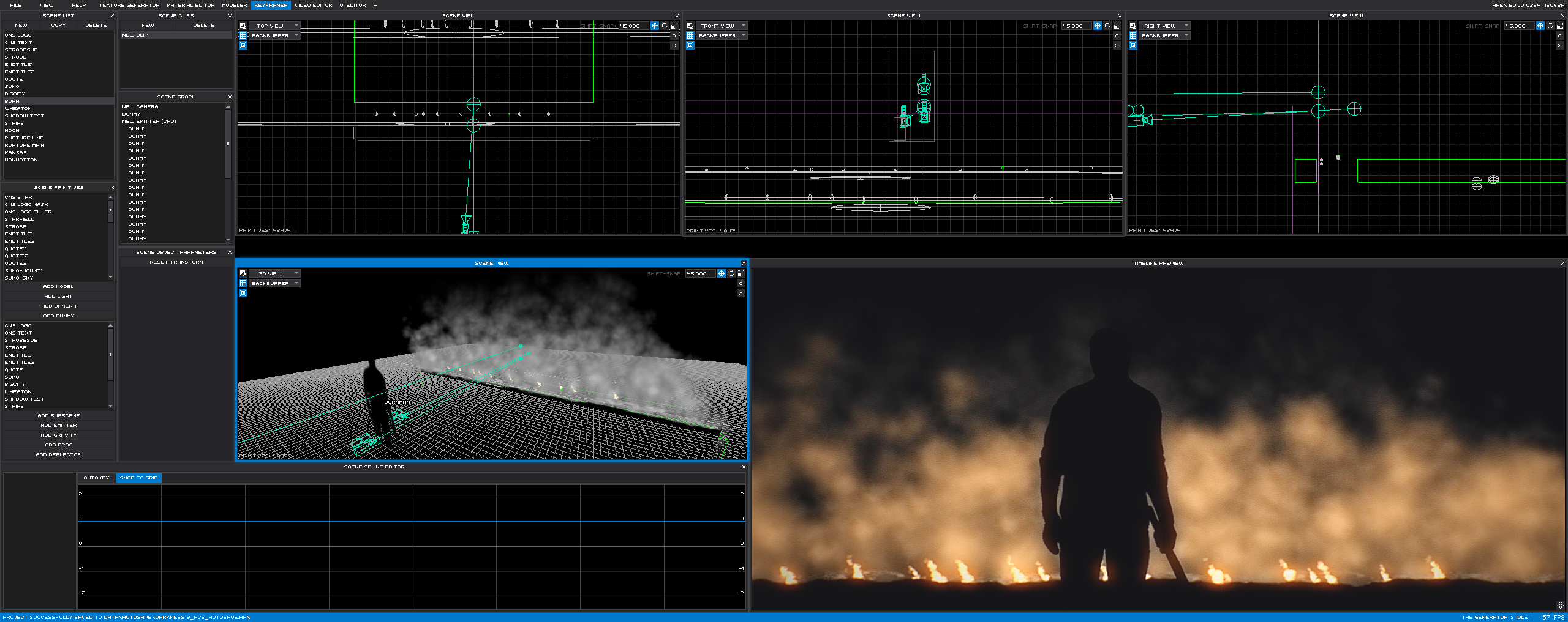
P.S.: for the maniacal guys out there or for those who want to spy the secret technology behind Conspiracy's intros, I've put two additional *BONUS* *EXCLUSIVE* *SCREENSHOTS* of their demotool here and here. Rip... errr... enjoy!!!
[Forgotten pearls of the demoscene...]
One or two demos you could have missed so far
One or two demos you could have missed so far
Let's face it: modern demoscene sucks.
Too many hexagonal lens flares, too many trilinear filtered polygons.
Too many satori demos and too few TBL DOS intros.
But, you know, as the title says, there is still hope in the past: maybe there's something to discover again in that beautiful period of our lives called "the nineties", when we listened to 2Unlimited and Snap, lens flares were just circular and to run some DOS intro you had to cross your fingers and hope that you had free enough of those 640k that should be enough for everyone. Or maybe those demos I'll speak about just suck, so you can just stop reading here and leave an angry, sarcastic message in the comments.
I don't care.
Modern demoscene is too involute.
Back in the nineties, you could have shown a torus (or the inside of a torus) and just ruled by doing that.
Today, you have to show 9 raytraced meta-toruses merging into each other, and you barely suck.
Yeah, your 12-part 4k with music isn't that bad for a firstie.
So, let's go back to the 90s and see some jewelry hidden in there.
Jive 2/Sublogic (1998)

We vote for pictures in 64k
And then, the music stops, and, what's that? An image. Not a crappy, B/W pixelated image, but a full colour image.
This is Jive 2, aka charlie chong.
This is "the second part in the famous 'Jive' intro series".
Oh, how much I love that nonsense feeling demoscene had in the 90s? Modern demoscene takes things too seriously. And it sucks.
Fyvush/Jamm (1994)

Who the heck was fyvush finkel, btw?
Ok, OK, Fyvush has some strange coder/psychedelic colours, makes more than one effect with palette cycling (THAT is so nineties), but, damn, which modern intro has upside down characters at the end? None. And NOT because no one makes DOS intros anymore.
Fyvush made a FAST rotozoomer years before all that cache shit by Pascal.
An please, PLEASE, watch that spinning hellraiser cube move smooth on a 386. Just buy a 386 to watch it, dude. It's cheap.
Overtone/Suburban (1999)

You *want* that, right?
I bet nobody remembers Suburban anymore. I do. They were the last defenders of Pmode/W, the wizards of bilinear filtering, the masters of DOS-era and 320x240 design. I have seen this intro live at The Trip 1999 and it rules. No that's not for nostalgic reasons. This post is not nostalgic. Shut up.
Overtone has everything you'd love in a DOS intro: 3d with overlayed wireframe lines, free directional tunnels and that lightray effect you'll drool on.
And music by pete e, one of the best (and forgotten) musicians of all time.
Now go hear all his modules. And then go watch all of Suburban productions.
Then return here and continue reading this.
Mother lode/fudge (1997)

That scaring 3d object you'll dream tonight
Yeah, probably someone still remembers fudge, but maybe for their "the clone" series. Nah, that's too mainstream.
Fudge invented the "super bon bon" effect (that's a trademark). The Fudge guys are soo cool that they decided to name a demo "planet groove" (what's more 90s than that?).
Mother lode features an aggressive music from croakr/TPOLM, and as said all effects are bilinear filtered (no, you don't need a Geforce GTX 690 for that). Mother lode has blue objects on a red background and red objects on a blue background. Mother lode is the prodrome to all the orange, TPOLM, TBL and everybody else's intros of the second half of the nineties.
Mother lode has that stylish, linear, fire-esque fudge logo you'll envy forever.
Pandemic/Byterapers (1997)

Sucho's copyrighted effect
You want to watch this just for that chick's picture. Yeah, that chick with the alien skin.
You want to watch this just for that underwater scene.
You want to watch this just for the [B] logo in 256 colours, even if the demo is in truecolor.
If you watch Pandemic, you'll appreciate 1bit animations and two overlapped, alpha blended free directional tunnels.
You would have never said that.
Space/Euthanasia (1997)

Space mushrooms
A little is known of this Hungarian demogroup, but one thing we remember is the absolute consistency of their productions, starting from the *names* of those production (always a one-letter word). Each production had also a powerful 3d-engine (640x400, not bad for 1997), capable of filling your screen with advanced software-rendered scenes. Each demo had also a little "story" in it.
"Space" is worth mentioning for the smoothness of its scenes and for the spacey killer-plant.
Only downside of this otherwise mythical group: re-releasing "Spirit" in the mobile demo compo at Assembly 2004.
But you know, no one is perfect and we can forgive Euthanasia for this. And love them.
Stream/mfx (1996)

Analog feeling in that mfx demo
"Stream" is full of symbols, strange writings (maybe because they are just upside down) and strange pictures.
And it has an astonishing lens flare (not hexagonal) running through an hyper-smooth tunnel.
Music is pounding, obsessive.
You don't have to try to understand mfx's demos. You just have to let them flow through you and be assimilated.
Blind/eufrosyne (1996)

*hexagonal* *lens* *flares* !!!
In 2 years, they managed to win Assembly, place in the higher slots of the most important parties, and write a masterpiece like "time zone + 13:00".
Blind *has* hexagonal lens flares. Yeah, almost 20 years before.
Blind has the usual circular distortions that are a watermark of Sucho (the same coder of Pandemic). And that "water" effect. You have to see it to belive and never forget it (again).
Public demand/purple (1999)

Watch the inside of a sphere...through a sphere
And an impressive goa-ish module by rez, that compresses down to 21kb (size counts).
I don't know what's appealing in this one. Maybe the danish-style pointillized background or such. For sure, travelling through two concentric spheres filled with particles is trippy. We want purple and danish style back, that's for sure.
So?
Probably there is more of this. Write about your personal, forgotten pearl in the comments.
In the mean time, I'll go watch Stash for the 124th time, just to hear that synth bass resonating in my subwoofer again.
(Greetings to sublogic, purple, euthanasia, fudge, blasphemy, soopadoopa, inf, quad, acme, cryonics, excess, tpolm, dubius, cubic team, $een, complex, jamm, moottori, eufrosyne, orange, japotek, deathstar, coma, nooon, wildlight, valhalla, psychic link, realtech, astroidea, capacala, mfx, bug2fix, camorra, doomsday, trauma, TPOLM and everyone I forgot - you made the 90s rule, guys)
(pssst: as always, we've packed those 9 gems here for your pleasure and your laziness. Watch with dosbox)
posted by friol
at 6/22/2014 09:40:00 AM - under:
64k,
demo,
demoscene,
nineties
- comments? here (4)
[The timeless way of building a 64k...]
A strange story and a masterpiece intro
A strange story and a masterpiece intro
"Do you know how many of these you can fit on a 1.44Mb diskette?"
Yeah, you probably do. The answer, by the way, is 1.474.560/61.952=23,8. Or maybe 42. Or maybe you have to take into account the space allocated for the boot sector, the FAT and the root directory. So that would really be 1.457.664/61.952=23,52. But I'm just digressing. The truth is that we want to talk about this 61.952 bytes intro (sometimes known also as "64k") that threw millions of coders into panic since the first frame appeared on the megascreen.
Yeah, because Mercury has *hexagonal* *lens* *flares*!
Yeah, because Mercury has *dust* *on* *the* *camera*!
(Did I say they have hexagonal lens flares?)

Hexagonal church
There were those two coders, urs and cupe, that had nothing to do that day, and were greedly devouring their copy of "The timeless way of building", a book by Christopher Alexander that explains how to create beautiful buildings using design patterns and blue screens of death.
Suddenly, urs said: "Hey, why don't we do a 64k for Revision, a 64k that has nothing to do with this book except for the title?!". Cupe answered: "Yes, that's a great idea! People will try for ages to understand what this book has in common with the intro, except for the title!!".
Unfortunately, in the next days, ideas were lacking (as usual).
But why inventing something when you can copy?
Yeah, that's a design pattern! That's the beautiful truth Christopher Alexander taught us!
So they started with an ocean scene, copied from NeHe's tutorial number 12, but adding *hexagonal* *lens* *flares*. Then urs came with a great proposal: "14 years have passed from fr-08: the product. It's time for another church scene, with multicolour glass and, obviusly, *hexagonal* *lens* *flares*". But cupe said: "Hey, I think people still remember that scene...". And urs: "Nah, just add more dust on the camera and that will be fine".
Things were going on steadily.
Urs added three or four camera paths "a-la-Elevated", one Still-esque scene with nonsense trapezoidal buildings, some more dust and, obviously, *hexagonal* *lens* *flares*. Then, the stroke of genius hit cupe: "Urs. Hey urs. I've got it. I've got our main scene for the intro. People have never heard of this". Urs said: "What's that?". And cupe: "Get ready: a *city* *scene*". Urs: "You mean... a scene with buildings, shadows, fog, reflections, hexagonal lens flares and all the rest...?". Cupe: "Yeah! That's fantastic! A scene where the buildings move like in Incep... err, where the buildings move!!! Isn't that insane?". Urs: "Yep...".

Trapezoidal buildings
Only one thing was missing: one majestic closing scene. Cupe&urs where out of ideas (as usual). In that precise moment, las came out of nowhere and said: "Guys, I've got your definitive, psychedelic, groundbreaking final scene! Listen: think of Times Square at night, think of the lights, the illuminated signs, the cars running and their lights reflecting on the wet asphalt!!! Think of that!". But cupe&urs said: "Are you joking? One scene with *cars*? What is this, some sort of 1992 Amiga prod? Or "Rush Hour" by nextempire???". And las: "But you know, this night scene, with some hexagonal lens flares...". "Oh, shut up and go back to your framework, you silly framework coder!". And las sadly went away.

Glared sunset stoups
The entire Mercury team was adding the last bytes to the intro. And a couple of hexagonal lens flares here and there. Deadline fastly approached. Then Okkie announced their 64k. Lights went out, strangely there was silence in the hall in Saarbrücken.
"The Timeless" started running on the screen.
Two coders committed suicide just as the first sea-wave rolled in. All of cupe's and urs' lives were passing in front of their eyes.
At the 10th hexagonal lens flare, many heads exploded just thinking of how the hell did they do that.
"The Timeless" was a milestone.
And at last, the final scene, some night city with cars, yes cars, and neon signs glared on the screen.
Las said: "But... you put this scene... this was my scene...", to whom urs&cupe answered:
"Shut up, you silly framework coder!".

You silly framework coder!
That's how a successful 64k is born.
Because, you know, it's not important if you copy 10 thousand times from Debris, it's not important if your scenes have no logical link, it's not important if a city scene has been seen in 4879128 different intros.
No, that's not what counts.
What counts, dear friends, is *hexagonal* *lens* *flares*. All of them.
Remember that.
posted by friol
at 4/23/2014 01:00:00 PM - under:
64k,
mercury,
parties,
revision
- comments? here (6)
[Intros that defined the 64k genre..........................]
Choose zero demotools and shaders
Choose zero demotools and shaders
There was an era when demotools were not needed to create a mindblowing intro, an era when 2D effects outnumbered 3D effects, sounds were not realtime generated but sampled, scene poetry was scene poetry and progress bars were made of ASCII characters. In that era the PC scene broke its Amiga roots and assumed its own shape.
This is a trip through that period and its milestones we still remember now, 15 years from there.
Symbology - Admire (1993)

Quite nice Admire logo
The 64k format wasn't perfectly consolidated (this intro weights 75kb, in fact), but intros up to 1993 had always shown quite static scenes and repeated the same cliches ad infinitum: multicolour plasmas, 3D starfields, shadebobs.
Symbology, instead, makes a technological step forward: it shows 3D scenes and a free camera, and an embrional but vivid "story".
The plasma-cube eaten by the landscape-wormhole is epical.
Drift - Wildlight (1995)

Shadows and floating typography
Drift shows some youth errors (full blue is a coder-colour, the 3D-julia is a nerdy and old effect), but the use of shadows and the (generated) music create an unpreceded episode. There are not toroids or ducks in this intro, but objects with a well-defined personality.
The end credits make you shiver still today.
Lasse Reinbøng - Cubic team (1995)

Eat more cough drops
The quantity of simultaneous rotozoomers in one of the first parts impressed everybody, running at full framerate on a 486.
Supermax - Complex (1996)

The beautiful colours of Supermax
A bunch of shiny spotlights and an extremely realistic bump mapping are enough to create a sci-fi mood. This time Complex needs no 3D scenes, no strange effects, only the title, some four fingers melody and a breathtaking typograpy.
Paper - Psychic Link&Acme (1996)

2D has been never so three-dimensional
Some moments, like the 2D drawing that comes to life and gains the third dimension, or the paper planes that fly along some splines at the end, are unforgettable still today.
Legend says that sceners at Wired '96 continued to build and throw paper planes for hours after seeing this intro.
Famous cyber people - Pulse (1996)

That's the eye of Mordor, isn't it?
Famous Cyber People doesn't impress for the variety of effects (at the end it's made of variations on the same one) or for the 3D models (during the whole 64k, only one is shown, and it's almost hidden), but for the beauty of music, pixeled images and chromatic choice.
The 2D bumped tunnel is something organic and threatening.
Deesbab - Orange (1996)

I can see the earth spinning
The constellations and alien sounds of Deesbab create in a few seconds an unique and inimitable atmosphere. We'll find echoes of this intro in masterpieces like Bjoer or Viagra, or in anything else, up to the SQNY productions. The makers of Bjoer (TPOLM) will negate the similarities with Deesbab, but it's like negating a portrait owes something to the Mona Lisa.
Drain - Vista (1997)

Scene poetry in full effect
Despite its low resolution, Drain doesn't look out of place if compared to modern intros. The number of effects, each one different from the others, is elevated. The technical mastery of the medium is impressive (there are a few intros with sound for GUS and Soundblaster).
Scenes are clean and linear, but evocative.
The cut between the purple free directional planes and the lens flare at the end is flawless.
Spotlite - Funk (1997)

A tree between the shadows
The scenes, if watched nowadays, have a really slow pace, but the spotlight of the title made people scream for a miracle. Even for modern intros, it's rare seeing a similar level of detail in object illumination.
It's strange that from a kitchen (where legend says that Digisnap, the coder, wrote this beauty) comes one of the most advanced intros of the last millennium.
And as a final gift, daTunnel has packed those 8 intros in a nice demozip. Watch it with Dosbox and imagine 1993 is here again.
 the Tunnel - demoscene blog